Transcarent · Case study 02
Evolve "one place for care" into one, cohesive design
Transcarent, a Series D health tech startup valued at $2.2 billion, serves clients including Fortune 10 companies. For two and a half years I was a lead product designer on a team of nine, working with roughly ten product managers and dozens of engineers, sales and operations colleagues.
- Role
- Lead Product Designer
- Team
- 8 UX/UI, 6 PMs, 15 devs
- Timeline
- Aug 2022 – Mar 2025
- Platforms
- iOS, Android, web
+40%
home page engagement after the redesign
100%
of zero-result provider searches eliminated
<5 mo
to launch AI telehealth after a $100M acquisition
22 → 4
steps to start a telehealth visit
The challenge
The platform changed shape for every client, and members couldn’t tell what was available to them.
Each client contract and add-on solution configured a different version of Transcarent. My work focused on helping members browse, search and act with confidence, and on giving every internal team one shared picture of the platform.
Highlight 01
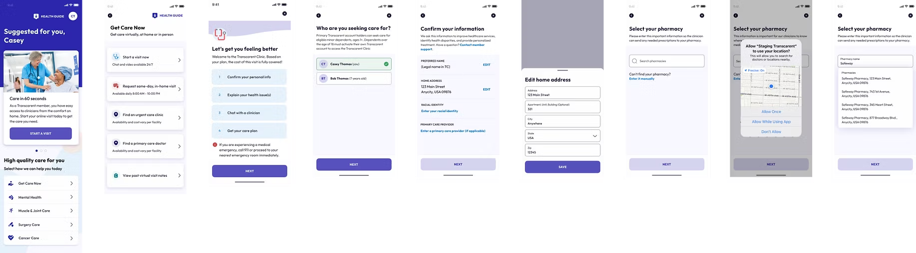
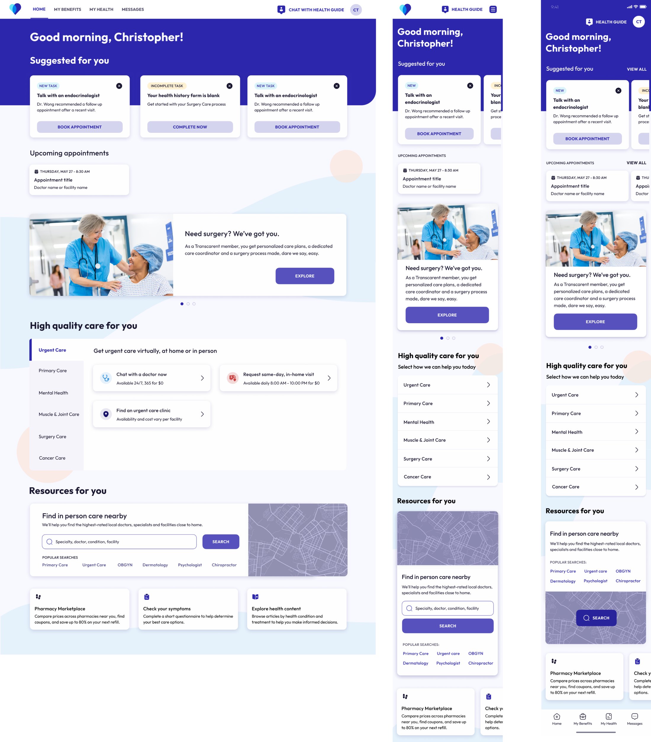
From a wall of tiles to guided browsing
Goal
Help members understand everything available to them, through categories and suggestions in plain healthcare language.
What I did
Testing showed members wanted guidance and the freedom to browse. I grouped care into categories and added suggestions based on onboarding answers and past activity.
Result
Engagement up 40%, with higher utilization across care experiences.
Highlight 02
Provider search with AI and price transparency
Goal
Fix the platform’s most-used tool so members find trusted, nearby care, and bring it into the new Wayfinding AI chatbot.
What I did
Mixpanel data shaped a landing page built around top searches. I added category search, partnered on a backend fix and surfaced plan-based costs from billing codes.
Result
100% of zero-result searches eliminated, faster search and cost info members never had before.
01
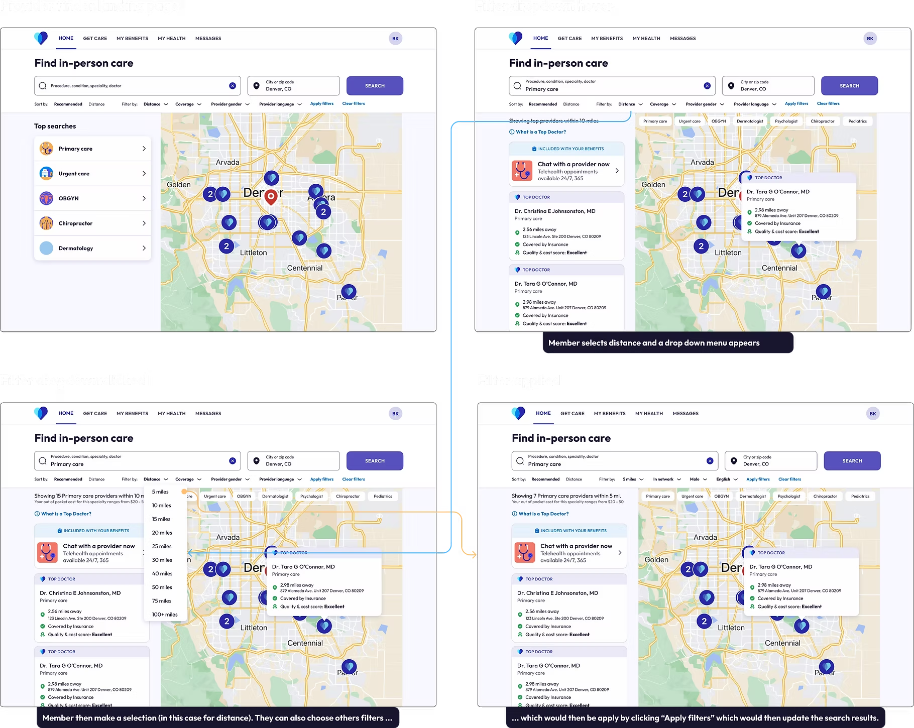
Lead with what members actually search
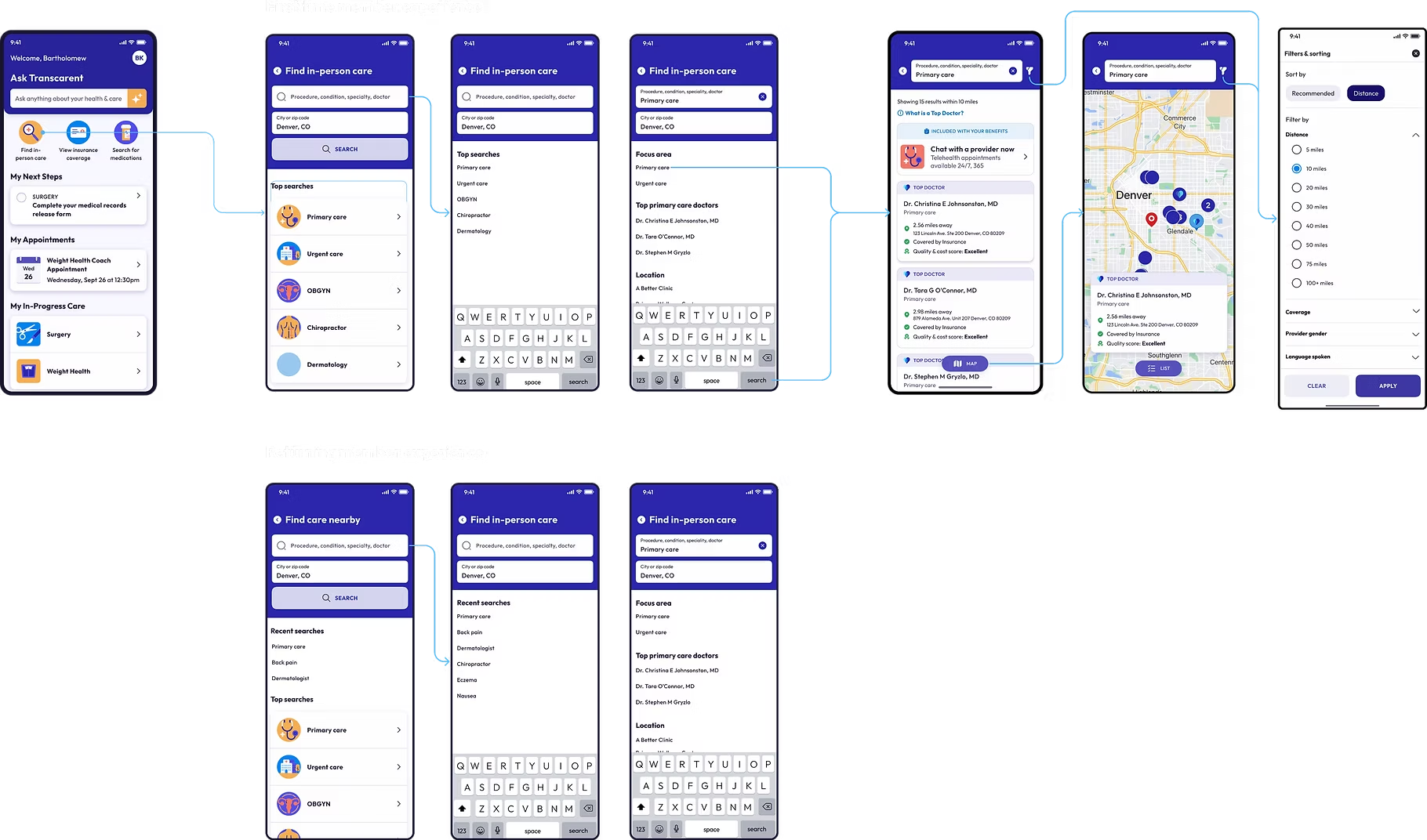
Mixpanel data showed the most common searches, so the landing page puts top searches and plain-language categories first. Behind it, I partnered on a backend fix, and filters for distance, coverage, provider gender and language apply together.
02
Carry it to mobile
The same flow works on a phone, from the home screen to top and recent searches, focus areas, results, a map view and filters.
03
Show the price before the visit
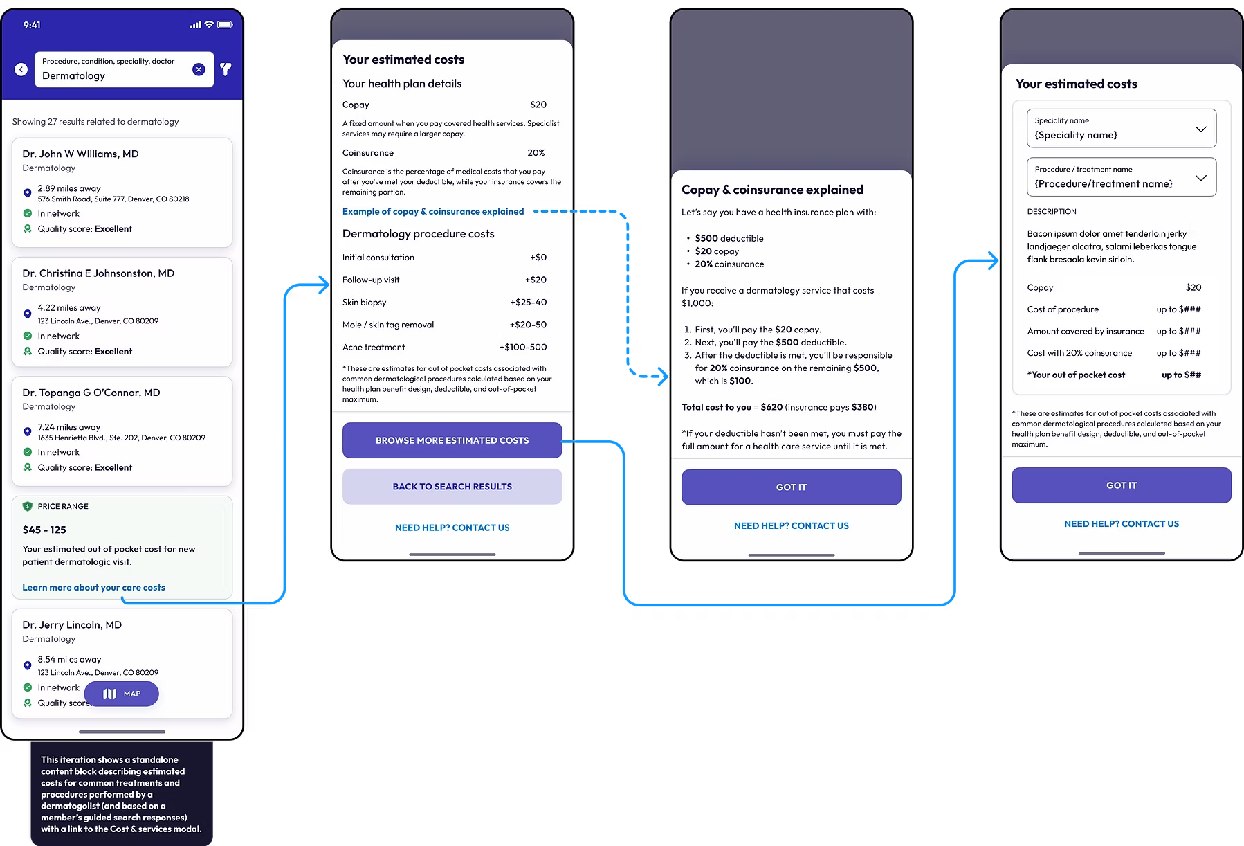
Cost estimates built from billing codes appear right in the results, backed by plan details, a plain-language copay and coinsurance example, and procedure estimates.
04
Fold search into the AI assistant
Members can ask instead of browse. Tapping Ask Transcarent opens a focused bottom sheet with suggested questions, the AI Care Assistant returns top providers right in the chat, and if search fails it hands members off to Find in-person care or their Health Guide.
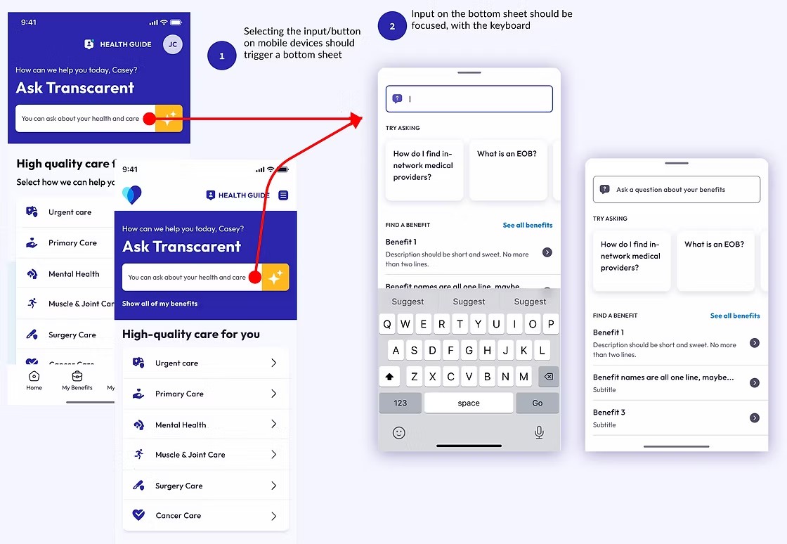
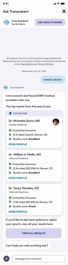
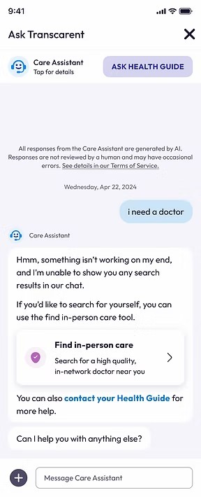
1 · Entry: tapping the input opens a focused bottom sheet with suggested questions. 2 · Results in chat: top providers with coverage, distance and quality. 3 · Fallback: a hand-off to Find in-person care or a Health Guide. Click any screen to open it larger.
Highlight 03
AI telehealth, integrated in under five months after a $100M acquisition
Goal
Rebuild 98point6’s legacy AI telehealth system inside our platform after a $100M acquisition.
What I did
Learned the backend, mapped the member journey, then designed the legally required visit start (with payment) and the post-visit follow-up and care plan. Mei Hsieh designed the visit itself.
Result
A new AI-powered telehealth experience, launched in under 5 months, helping clinicians support members before, during and after each visit.
01
Map the whole journey
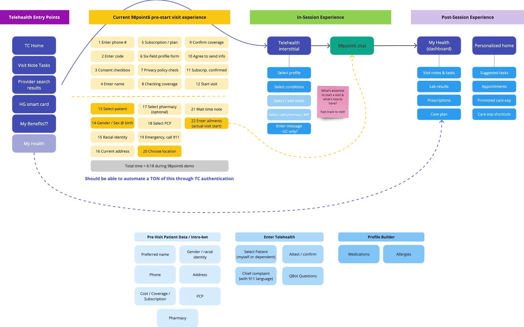
I mapped every touchpoint, from entry points across the platform to the post-visit dashboard. The legacy pre-visit flow took 22 steps and 6:18 in a demo, and much of it could be filled automatically by a member’s Transcarent sign-in.
02
Cut the way in down to what matters
The new entry flow keeps what’s legally required: who the visit is for, confirming information we already have, home address and pharmacy, before handing members to a clinician.